DBT x Gopher Energy
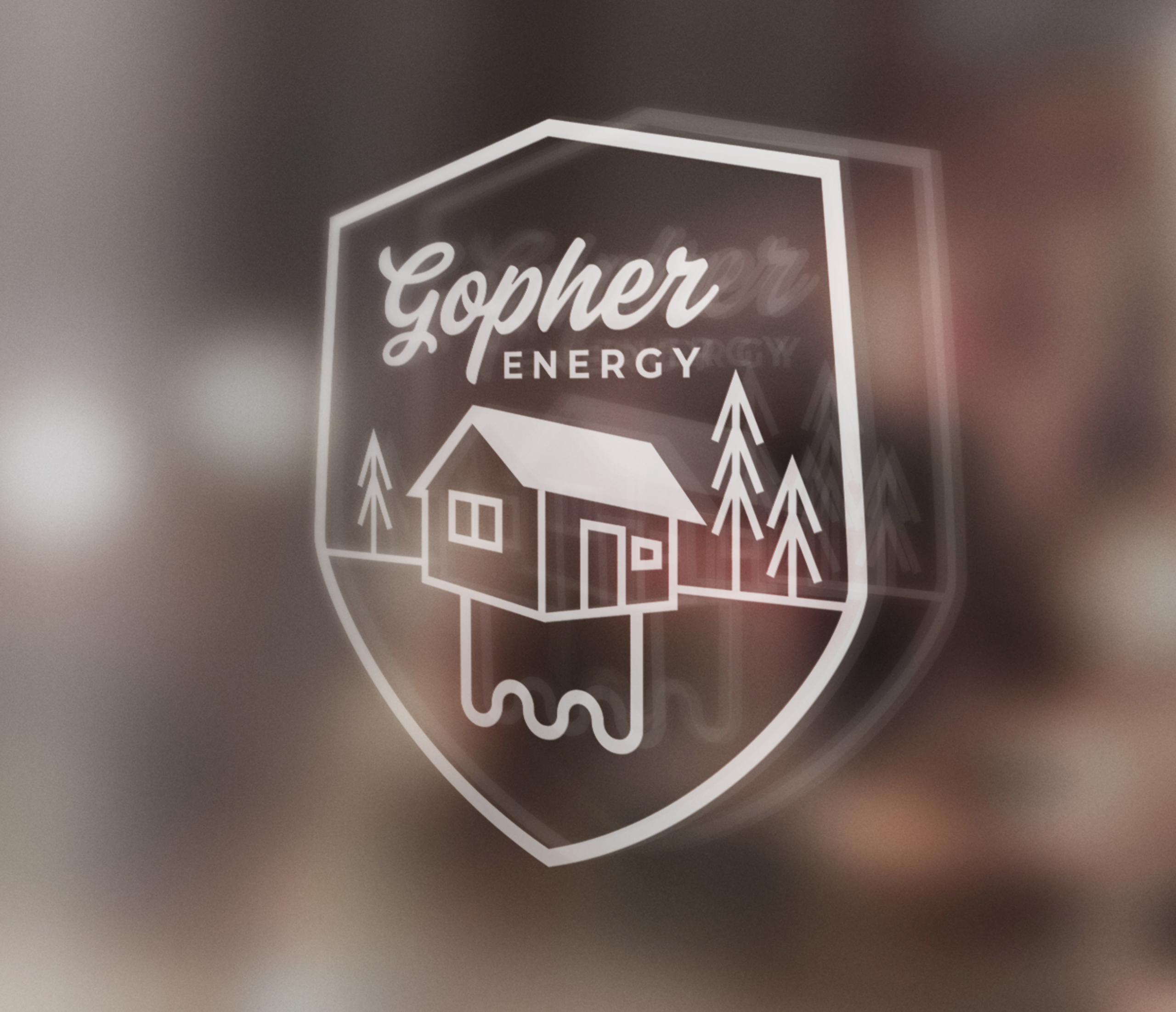
An audience-centered discovery process led to a new brand mark, colors, and typography that helped Gopher energy illustrate what geothermal energy actually is.
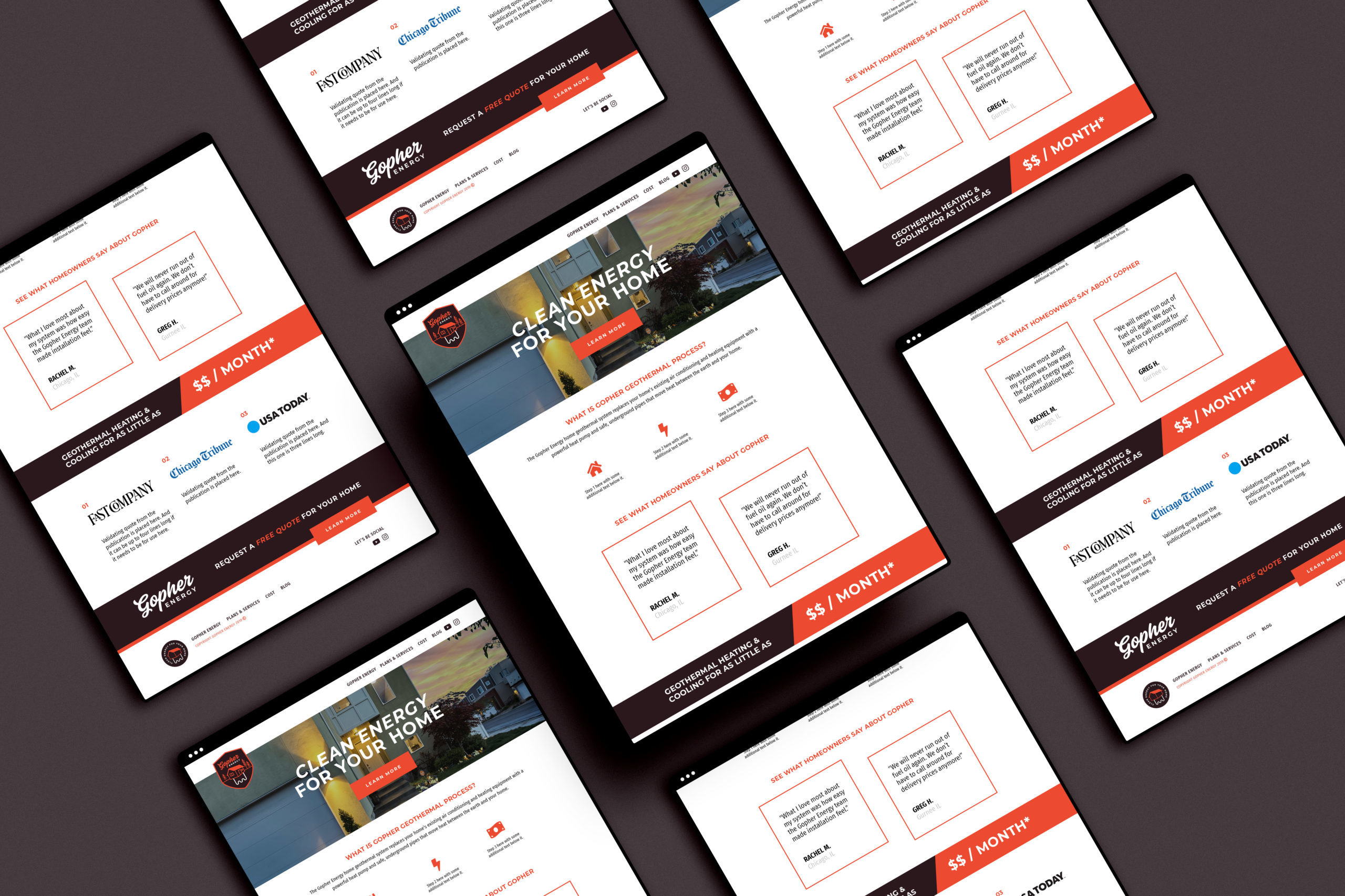
Making Energy Accessible
Starting a new geothermal energy company is no small feat and the branding shouldn’t be either. Our client wanted a strong, masculine mark that helped illustrate what geothermal energy actually is.
We worked closely with the client exploring brand directions that best fit their needs and appealed to their main audience.

We also built out and worked through a variety of alternative marks to give Gopher Energy as much versatility as possible. The brand language was built to work on digital, print and stamped in metal.
We’d love to change the world… with you
Work With UsMore Projects
DBT x Democratic Attorneys General Association
Democratic Attorneys General — the “People’s Lawyers” — are often the last line of defense on civil rights, reproductive rights, and the wellbeing of everyday…

DBT x Reconciliation Canada
Reconciliation Canada aimed to celebrate its 25th anniversary with a powerful end of year campaign that uplifted its work to facilitate healing conversations across Canada.